
Published on Main

Published on Main
Venue Type
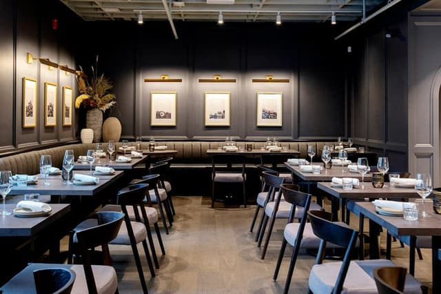
Upscale restaurant presenting innovative, carefully sourced cuisine amid retro-chic surroundings. The design was centred around traditional finishes aging with the space over the years to come.
Number of spaces
Cuisine Type
Food & Beverage
Spaces
About
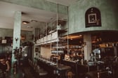
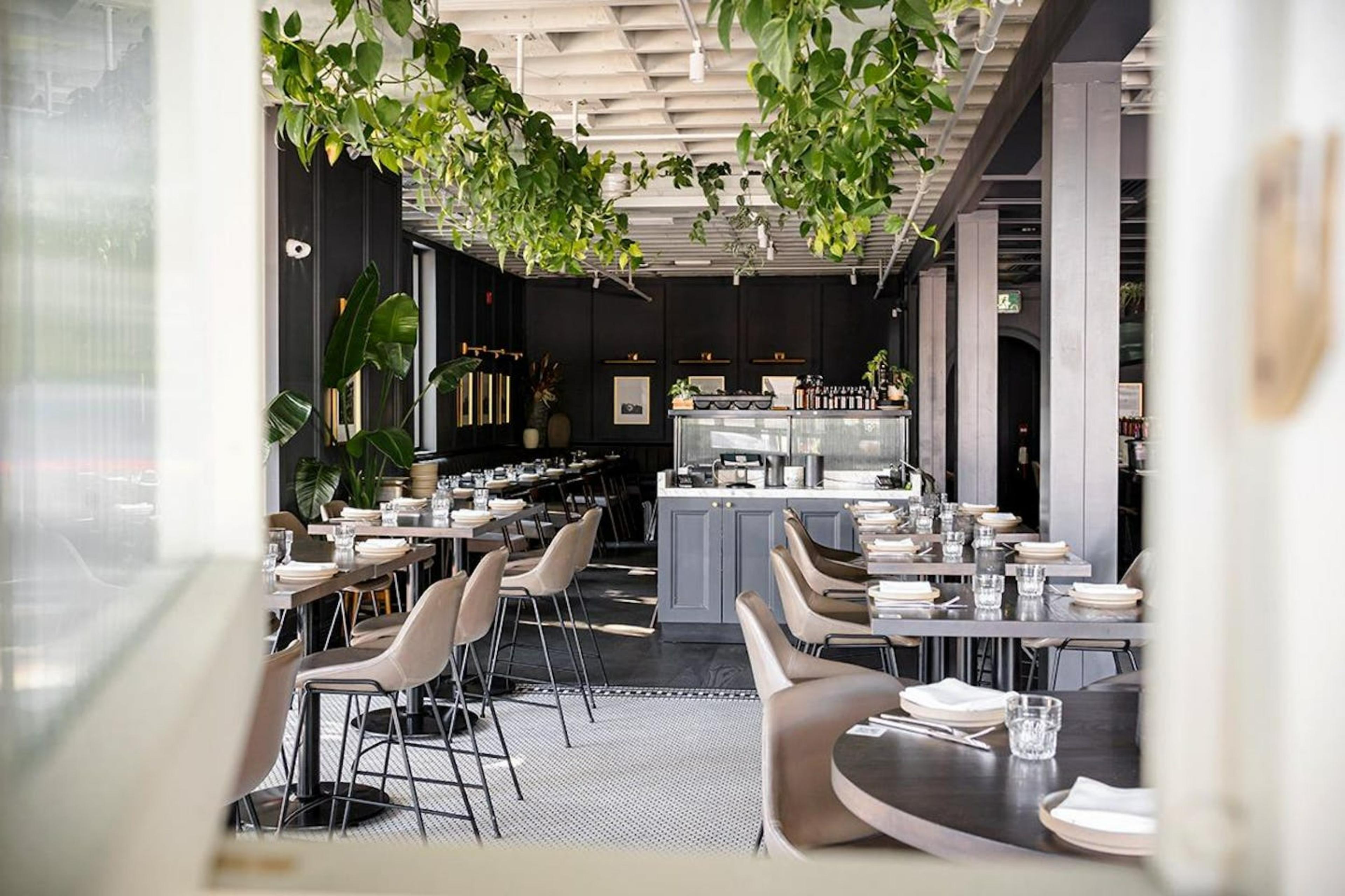
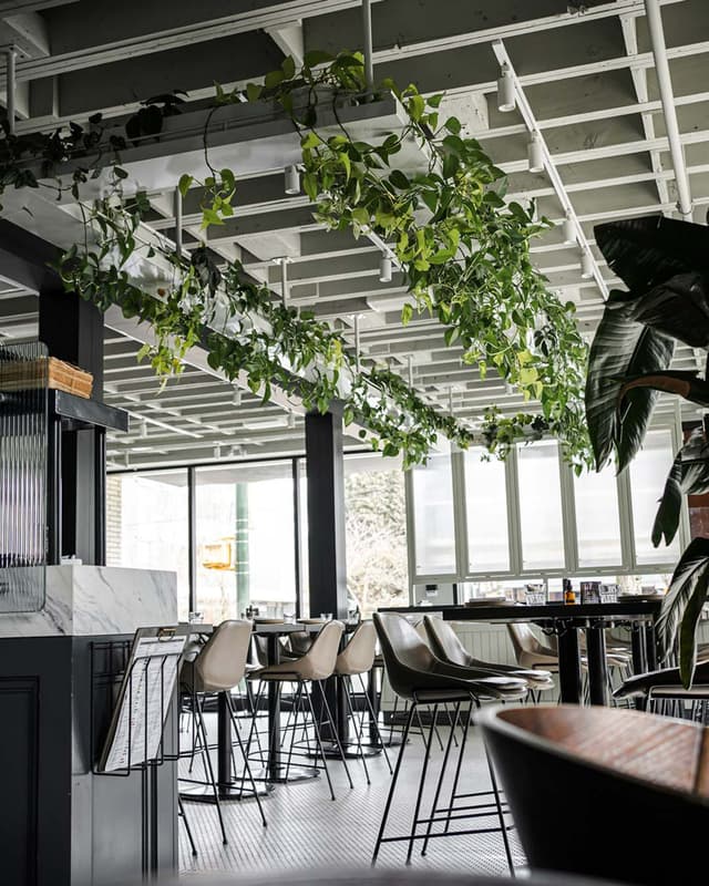
Inspired by traditional English coffeehouses from the 18th century, which acted as the primary centre for communication of news in local communities at the time, these public houses were spaces where publications could be distributed, communicating with the masses. The restaurant was divided into two separate areas. The front, a ‘solarium’, where pale green tones and natural cane were used to create a light, more natural aesthetic. Counter height seating allows for a less formal approach as this was integral for a casual and welcoming atmosphere. A suspended plant canopy allows for vines to grown and creep at will. In the rear dining room, traditional panelling was used as a feature. Dark tones to the wall and ceiling over the garde manger bar create a more intimate space for evening service. Both areas were tonally linked to create a subtle transition from one space to the other, reflecting the considered, locally sourced menu that changes with the seasons.
Discussions
Press


Details
Food & Beverage
Do you work for Published on Main? Contact us to learn more about who's managing this profile or gain access.
%2F-123.101296%2C49.25283459999999%2C13%7D%2F300x300%3Faccess_token%3Dpk.eyJ1IjoibWF0dC12ZW5kcnkiLCJhIjoiY2xlZWZkNTQ1MGdhZTN4bXozZW5mczBvciJ9.Jtl0dnSUADwuD460vcyeyQ)